Saturday, 31 August 2013

Show & Tell Saturday: Kitty Canvas

Hello again!

Well...another month over and done and into autumn we go then! Even though the nights will be closing in, that means we'll have all those GORGEOUS changing leaf colours as inspiration - beautiful and abundant warm earth tones splashed with the gold of autumn sunlight.

In celebration of a lovely summer, I created a little 8"x8" canvas as a birthday gift and thought I'd take some process pictures to blog for the Artists In Blogland Show & Tell Saturday. So, without further ado - here we go!

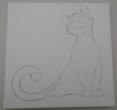
Stage one was to choose a pose and sketch it, then to add crumpled tissue texture in layers to a thinly gesso'd canvas, building the kitty cat up a little from the background in the process:


I wanted kitty to look cute and friendly, not aiming for uber realism, more something cuddly and lovely to look at.

Adding some layers of shade and colour with neocolorII wax pastels and Faber Castell Pitt pens.


Time to add some colour to kitty.


The texture from the tissue paper helps when adding colour with wax pastels. Time to add a garden for kitty to sit in. I raided my die-cuts box for some flowers - they're K&Co ones from the Brenda Walton range ...I've been saving them for something special!

You know....this pic looked FINE on the camera....MASSIVELY fuzzy now! How irritating! I used Claudine Hellmuth's Studio matte multi-medium (from Ranger) to adhere the tissue paper and all the flowers. It leaves the surface nicely prepared for  any paint or other medium added thereafter, whereas Mod Podge can be a little smooth for some things - wax pastels, for example! I had fun with paint splatters and then put the finishing touches to kitty and his garden:

I glued the butterflies to the canvas with Groves Hi-Tack Fast Tack Adhesive. I've used Glossy Accents before but find that it's not awesome for this as it tends to dry out and crack over time.

Voila! One kitty. Hope you like him! Sending out my hugs to you for an awesome September - here's wishing something lovely happens for each and every one of us and those we hold closest to our hearts. - Shroo :)

PS - don't forget to have a visual hug of some of the lovely posts by other splendidly gorgeous artists by clicking the pic below! xxx

Monday, 26 August 2013

Bernie Wrightson - Master of the Macabre!

Hi !

Welcome to another of my "influential artists" blog posts. This time I'm highlighting the incredible work of Bernie Wrightson, with special focus on his now world famous illustrations for Mary Shelley's "Frankenstein".

Bernie Wrightson is an American artsist who works predominently in pen/brush and ink. Perhaps his first widely recognised success came when he co-created the character "Swamp Thing" for DC [comics] on the early 1970s.


DC's "Swamp Thing #9" comic cover, featuring Wrightson's character design in full awesome glory!

A pen and ink character sketch, below - a full colour illustration of "Swamp Thing".


Wrightson's style and love of classic horror illustration gave him a unique ability to transform a concept into a grimly fascinating and highly detailed reality making him an instant success with fans of the genre.

Wrightson's art credits over the years include countless illustrations for books and magazines, as well as more comic work on titles/characters including The Punisher and Spider-Man and Batman, amongst others:


His style has proved to be the perfect complimentary element for several Stephen King novels, illustrating 'Cycle of the Werewolf'. 'From a Buick 8', 'The Stand', 'The Dark Tower volume V: The Wolves of Calla' along with 'Creepshow'.

Although I pretty much love ALL his work and one day DREAM of owning an original piece to hug and love and gaze at adoringly *sigh*.... this post is about the influence his work had on me and my own art. For that, we have to look at his INCREDIBLE work illustrating "Frankenstein". Oh yeah... I know....awesome.....

Living in a little town in the years before everyone had t'interweb, the only way to find gems of new artwork was in books. Yeah - remember them? Well - fortune granted me the privilege of having a Saturday job in the ONE bookshop available. Guess what happened to my wages every week.....Yuh-huh - I did buyded many lots of books of awesomeness I so very did! ONE of them shone a spotlight on the new elite of the fantasy illustration world - the very same tome where I discovered the awesomeness of Charles Vess (read my blog post HERE). Within its beautiful pages there was a chapter which pretty much blew my mind - the work of Bernie Wrightson.  There, in astounding detail, were illustrations from "Frankenstein". I've LOVED horror stories and movies since I was a tiny wee girl (much to my mother's distress!) and here in front of me were images that opened up the world of Dr Frankenstein and his monster on a whole new level. I bought the book and was lost in those pages for HOURS. This is why:


Yeah. Oh yeah. Look closer -


To say there's a lot of detail is the epitomy of understatement! This is EXQUISITE work... In these illustrations, Wrightson uniquely fuses a classic concept and technique with a whole new way of thinking creating a hybrid style of his own: intricate work of breathtaking beauty breathing life into the dark and ghoulish, violent world of the horror genre.


 Looking at his work in these pages, I almost overlooked the horror of some of the scenes...in studying the techniques and the effects of his work on the Monster himself I forgot, for a moment, so view him as a whole - to see the creature as an horrific creation, and in doing so I found a deeper understanding of the text of the book when I re-read it that week. It was an epiphany which not only inspired me to practise new techniques in my art, but also gave me a new appreciation of literature, a desire to look deeper into the layered sub-texts of the stories I read and it enhanced my enjoyment of these elements in my life more than I can effectively describe.


Look at the illustrations - forget the grisly subject matter for one moment and see it as a whole image. It's the gift of an illustrator to have a particularly exceptional eye for composition and these illustrations have an almost movie-like quality to them....a director's view, as it were. They're compelling from the outset.


Illustrators also seem to have an impeccable eye for minute detail - an almost anal retentiveness for the minutiae so work doesn't disappoint upon close inspection, rather tends to further delight. Wrightson's work - especially on THIS series of illustrations - is a perfect example of this.  This collection took Bernie Wrightson roughly seven years to complete and they have had worldwide acclaim, yet I read in interviews that when he looks at them now he can still pick out flaws and imperfections that he would correct if he could. Astounding.


Take a look at this picture above. Study how he uses a simple white void-space to indicate light to such effectively dramatic effect. There's no skimping on detail either...no time-saving scribbles to fill in space in that straw. In comparison to his other illustrations, the are far fewer outlines or edges, he achieves definition by using mainly cross-hatching or varied thickness of shading lines instead.

***It's worth noting that a (complete idiot) tutor I once had the misfortune to have to study under informed her class that "cross-hatching was a poor man's shading method, out-dated and ugly". Oddly we didn't really get along. Bernie Wrightson = genius .... tutor = fad-obsessed moron. Moral: Never assume that an art course or degree will automatically ENLIGHTEN you or define and validate you as an artist. "Self-taught" is not a sweary phrase! ***

Summing up, Bernie Wrightson is pretty damn awesome and that's a fact. I know that some of the imagery or ideas behind his work might not be to everyone's tastes, but his skill and tremendous versatility within his chosen field is beyond impressive and LONG may he continue drawing monsters and zombies and superheroes FIGHTING monsters and zombies! I will forever be in his debt and forever be an admirer of his work.

You can see more of his work on "Frankenstein - or The Modern Prometheus: Illustrated Edition" HERE, and find his illustrations for MANY titles on ebay, Amazon or - best of all- IN YOUR LOCAL BOOK SHOP! Don't forget to check out your local comic shop for comics and prints and art books as well. Also, it's WELL worth knowing that Bernie Wrightson and Steve Niles have collaborated on a sequel called "Frankenstein Alive, Alive!" published by IDW comics. You can find an interview about it HERE.

I hope you've found this interesting. Please feel free to comment or contact me - I'll get back to you as quickly as I can I promise! Don't forget to check out the "Color This Quote" September challenge/prompt on Artists in Blogland - click the pic below


I shall leave you with a cool zombie pic, because you know you want one! Hugs from Shroo :)


Saturday, 17 August 2013

Mouse Companion

Hi again!

A little sooner than anticipated....but by request, here's the companion illustration to "Papillon Mouse" - "Snail Tail"

...and the obligatory closey upness:


Mousey cuteness. See you soon! - Shroo:)

Friday, 16 August 2013

I thought you might like this...

Hi!

How you doin'? Hope you've had an awesome August so far. I've had an uber busy couple of weeks and, for the first time in a while, I've not had much opportunity to faff about with arty stuff. Hmmm.... SO, I do have a couple of posts lined up for you - the next in my "Awesome Artists" series for one...that's been a while getting here.... *tsch*....I'd forget my head if it wasn't nailed on.

In the meantime (so you know I've not forgotten you) here are a couple more of my black and white wildlife illustrations for you to peruse.

 And a couple of close-ups just for the heck of it...


This was a gift for my uncle who, like me, had a passion for the sea, ships and marine life.

Li'l 'Papillon Mouse'. I'm almost ALWAYS overly picky with my art and find imperfections that annoy me, but I actually liked this mousey from the get-go... awww... Hope you like him too.

...Butterfly mouse bottom..... hee hee!

If you're interested in art supplies and such, my pen of choice is a Tachikawa fine-nib, something like this:
It has an incredibly fine flat-tipped nib, ideal for fine work, and the cartridges are black india ink so you achieve excellent contrast on white (or even off-white) paper. The pens don't last forever, but you well and truly get your money's worth. They're not the easiest thing to find in shops, but you can order them - and other VERY cool art supplies -  here (click the pic) :

Okee - hope you like the post and the pics, and find the link useful. Much like Arnie, I'll be back! And soon! Mooowahaha!!! Hugs - Shroo :)


Wednesday, 7 August 2013

National Exhibition of Wildlife Art

Hi all!

Here's hoping you're having a splendid day of awesomeness? I've recently been fortunate enough to be accepted by the judges for the National Exhibition of Wildlife Art, exhibiting a single large piece in pen and ink with watercolour called "Madagascar". The picture measures roughly 30"x40" - there's a space restriction and this took up every inch! I'm thoroughly chuffed as some lovely, LOVELY person bought it! So I thought I'd share the picture with you and send my thanks to all the splendid people who make the exhibition.


A few close-ups:


Hope you enjoy the post ! Mucho hugs - Shroo :)

Tuesday, 6 August 2013

Show & Tell Saturday (Eventually!)

Hello lovely people!

This post - a wee bit later than planned  - is a 'thank you' to the people at 'Artists in Blogland'. The site is such a wonderful source of inspiration and holds links to so many beautiful, beautiful blogs! I wanted to participate in their 'Show & Tell Saturday' post, so this is my contribution - hope y'all like it!

The last couple of weeks have seen my emotions dance all over the place, finally edging further towards the stress end of the scale  as my mum went into hospital. OOOH blimey! - Sleep's been a little elusive so, rather than just sit staring at the wall I opted to push myself into a positive process, working through the grot in a cute little art journal I made a while ago from junk mail and scraps.  It's roughly 8"x6",  just held together with simple three-hole pamphlet stitch, no mess, no fuss. All the pages are covered, once it's stitched, with random colours of crafters acrylic paint as a base coat, which can either provide inspiration or challenge depending... I use washi tape to strengthen the spines of the pages (wet media'll rip through even the toughest junk mail paper eventually!) and there's just the one signature, that way I can keep the journaling focused and themed - a little time capsule, kinda thing.

I decided that each page would feature collage, both magazine images and hand-cut scrap paper assemblage. I also decided to use up some stickers and rub-ons that I've had in my stash for, oooo... - eons, and use ONLY scraps - no chopping up new papers until I've reduced the stack of odds and ends. With so many icky feelings to process, I made extra effort to work through the rough stuff, finishing up with a positive message - it was really important to me. It's an especially good thing I did, as I ended up giving it to mum to look through while she's been in hospital, as I know she likes to enjoy my journals and use them as a talking point with other people. It's worked quite nicely. It's meant that some of the pages are quite multi-layered, which has actually been helpful for the mental and emotional purge, reflecting my often jumbled state of mind!

After thinking about how to do justice to the Artists in Blogland prompts, I decided to share this journal with you, my awesome blog readers. It seems like an ideal opportunity to show why I value art journaling so much - apart from anything else, it can be such a perfect theraputic tool, not just recording my journey through life, but my growth as an individual.  So, let's dive in, eh?


Some of the pages are quite scrappy - they reflect my jumbly thoughts at that time, if I'm honest, where I was finding it tough to access "the artist within" thanks to all the stress fog clogging up my brain. All the collage elements on this page are from magazines - including the blue circles. I over-painted the bird and the flowers and added a whole heap of 7 Gypsies rub-ons - easy and fun. I used dark Pitt pens a lot and enjoyed the way the ink picked out the scraper lines in the background acrylic. I do so love Pitt pens!

See what I mean about 'scrappy'? Yep. This was a blank day with a head full of mush. I ended up just literally throwing blobby inks at the page. It's messy as hell, but it didn't 'arf make me feel better at the time.

**A note - Cutting out your own arrows and chevrons, hearts and stars and such like is a GREAT way to use up diddy scraps of paper. Next time you're looking at all the new releases from big crafting companies, think on about what you can make for yourself with NO outlay of cash. Sometimes we all forget that a lot of what we pay for is pretty packaging - the actual embellishments are SO easy to make at home, and way more individual.**

Okee - next page... This split page is in response to another 'Artists in Blogland' post with the prompt "SEIZE THE DAY!" It did actually give me pause to think about where was emotionally RIGHT AT THAT MOMENT and where I wanted to be,  and I am so happy with how this came out.


This was a really fluid-process page which evolved pretty much by itself. I actually started with the smaller centre flap, adding some lovely wood-grain patterned washi tape to make it look like a door. I added some depth of colour with the trusty Pitt pens, then some stamped hinges and a door handle (from Crafty Individuals). Rather than splitting the page further, it actually helped me find a flow....a 'before and after' type idea. I cut more circles from paper scraps and old book pages and added the cut out tree trunk and some polkadot stems. I think I've mentioned before that I use a lot of symbolism in my art - not always mahoosively complex or subtle - but it's a superb way of expressing myself....I'd recommend giving it a go, instead of adding a lot of text...see how it makes you feel a) while you're working - does it help the flow? And b) when you look back at it - do you feel more positive? Less intimidated?

I added a few key words with a mixture of dimensional stickers, mixed alpha stickers and rub ons, some washi tape (that seemed to fit the feel of the page) and some doodles. This isn't really a complex page, but I had real fun doing it, mixing layers and textures and actually REALLY enjoying the process. Now, moving on....

Have you ever felt that, between where you ARE and where you want TO BE is a mighty hectic motorway in the middle of rush hour, cars and lorries hurtling left and right at vision blurring speeds? Hmm? Yeah, that was me when I did this 2 page spread.  I kind of ended up with an under-the-sea, reefy type of imagery - back to my marine comfort zone - but I really like this. There are a LOT of layers, which seem to get lighter and prettier each time which makes me tremendously happy! I'm really quite easily pleased!

I used a lo of splooshy stuff... acrylic paints and inks, spray inks and chalks, patina inks, distress inks, Tattered Angels glazes and also Pitt pens, inktense pencils, and a white gel pen. The collage elements are as varied - designer scrapbook paper scraps, paper cut outs (shells and pussy-willows), layered stickers, rub-ons, washi tape,  and abstract wavey shapes cut from coloured baby-wipes (from mopping up ink on another page!) I think it's the colours I like the most. I feel good about it and I can see the clear path right down the middle.

...And staying on the ocean theme...


This was a day of trying to sort out my feelings, stop spinning in circles and choose the right direction... I cut the octopus from a scrap piece of paper and coloured him with Caran D'ache Neocolor II pastels, then while they were still wet I added ample sploshes of Tattered Angels Glimmer Glaze. It left him with a mottled matte/gloss mix pattern which looks kinda awesome! Again, there are several layers hand-cut from scraps. I used acrylic paints, Pitt pens, Derwent inktense pencils, uni ball white and black gel pens, Vintaj patina inks and several 7 Gypsies rub-ons.

The flip of the page is dealing more with me acknowledging that there's no real escape from events - we always have to return and DEAL with things PROPERLY at some point, better sooner than later -

Collage elements are the cut out fish and the layered waves. It's a simple page that didn't take much time, sometimes that's a good thing!

OOooo - hey, guess what?

Yep! Another mermaid! I know, I know, but I'm not gonna change my art addictions now!! She's cut in three pieces - body, tail and hair. Her tail is a homemade sheet of highly textured paper which was fun to cut up and use. I used Neocolor II pastels and inktense pencils along with Pitt pens and highlight detail with my white gel pen. I added a selection of rub-ons as well as vellum stickers and adhesive gems. The page was so bright and sunny that I added the following motto :
"Wherever you go,
no matter what the weather, 
always bring your own sunshine."
This page - despite being the last one finished - is right at the front of the journal, and I like the idea of this positive sentiment reflecting my intention to end each page image in a positive way.

This is the only single page in the book with no collage element - 'less you count the flowers on the divider page there....I keep having visits from a stray cat - he's a sweetie, but not really up for cuddles. He's been in the house a few times and my own cat's not overly bothered so he's not a worry. I just felt like having two pages to just record some lovely....pretty kitty, summer flowers, butterflies. A serene moment in the midst of all the chaos. After I took this picture I added another motto on that middle divider -
"SHINE!
Be who you are and say what you feel,
because those who mind don't matter, 
and those who matter don't mind."


There are a couple more pages in the book, but I figure that those shown above give you an idea of the purpose and the process of the book. I hope - REALLY hope - that you find this useful. Art journaling has been such a valuable tool for helping me to navigate life's pathways and I feel that it's a duty and a pleasure to pass the idea and inspiration to others. If you're looking for prompts and inspiration, they're all around you and within you, but you might find it helpful to look at the Artists in Blogland site, and some of the blogs linked by them on their pages. You never know - you might be adding your own contributions soon!

Thanks for visiting and reading my post. As always I welcome comments and feedback. Enjoy creating your own beautiful art, whatever your style or experience! Come back any time as there'll be more posts up here very soon. Big hugs as ever - Shroo :)